In the home services industry, your website is often the first and most important sales interaction a potential customer has with your business.
Here at ArsevMedia, we always tell our clients "your website is your main marketing asset" because it is.
Whether someone is searching for roofing, cleaning, plumbing, or exterior services, their decision to call or request a quote is heavily influenced by how your website looks, feels, and functions.
In 2026, high-performing home service websites aren’t just visually appealing, they’re strategically designed to convert. From intuitive navigation and clear calls-to-action to strong UI/UX and messaging that speaks directly to the ideal customer profile (ICP), the best sites remove friction and guide users toward taking action.
Below are 7 hand picked real-world home services website examples that convert.
What Makes a Home Services Website Convert?
Before diving into the examples, it’s worth understanding what the strongest home services websites consistently get right.
High-converting sites are built intentionally around clarity, user experience, and trust.
The best-performing home service websites focus on:
- Clear, visible calls-to-action (CTAs)
- CTAs should be easy to find and understand
- Primary CTAs should appear above the fold so users know what to do immediately
- Simple, intuitive navigation
- Visitors should be able to find the right service in seconds
- Clear separation between services (residential vs commercial, service types, etc.)
- Strong UI/UX design
- Layouts should be easy to scan and visually organized
- Pages should guide users naturally from information to action
- Imagery aligned with the target audience
- Images should reflect the company’s ideal customer profile (ICP)
- Homeowner-focused businesses should show residential settings
- Commercial services should feature real job sites and professional environments
- Copy that speaks directly to the ideal customer
- Messaging should address customer needs, concerns, and intent
- Avoid generic language and focus on what actually matters to the buyer
- CTA buttons that stand out visually
- CTA colors should contrast with the rest of the design
- Buttons should draw attention without clashing with the brand
- Strong trust signals
- Reviews, testimonials, guarantees, certifications, and credentials
- These should be visible—not buried deep in the site
- Mobile-friendly, fast-loading design
- 60 to 80 percent of traffic is mobile
- Speed and usability directly impact conversions
- Immediate clarity on services and service areas
- Users should instantly know what services are offered and where
Every example below demonstrates several of these principles in action and shows how thoughtful design decisions directly influence conversion rates.
7 Website Design Examples That Convert
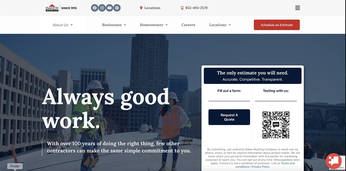
1. Baker Roofing Company
Baker Roofing Company is a strong example of how clear structure and user-friendly navigation can drive conversions for a large, multi-service contractor.
The site immediately establishes credibility, but what truly stands out is how easy it is to navigate. Users can quickly determine whether they need commercial or residential roofing services and are guided to the correct section without confusion.
The navigation is intuitive, allowing visitors to find information, explore services, or request a quote with minimal effort.
Why this site converts:
- User-friendly navigation that’s easy to understand on first visit
- Clear separation between commercial and residential services
- Logical site structure that reduces friction
- CTAs placed where users naturally expect them
Key takeaway: Clear navigation and service segmentation help users move confidently toward conversion.
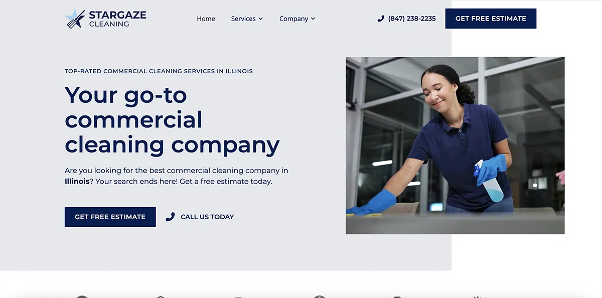
2. Stargaze Cleaning
Stargaze Cleaning is a strong example of how clean branding, intentional imagery, and clear site structure work together to create a high-converting commercial service website.
The brand presentation is polished and consistent, with imagery that clearly reflects their ideal commercial audience. Services are clearly listed and easy to understand, helping visitors quickly confirm that Stargaze offers exactly what they’re looking for. The site structure feels organized and professional, with well-defined service pages and localization that supports both user experience and SEO.
Call-to-action buttons are placed strategically throughout the site, but they don’t overwhelm the experience. Instead, they appear naturally as users move through service pages, testimonials, and company information—making it easy to request an estimate when the timing feels right.
Why this site converts:
- Clean, professional branding that builds trust immediately
- Imagery aligned with commercial clients and real-world use cases
- Clearly listed services with dedicated service pages
- Localized service pages that support search visibility and relevance
- Logical sitemap and site structure that’s easy to navigate
- CTAs that stand out visually without disrupting the user experience
- Trust signals that reinforce professionalism and credibility
Key takeaway: When branding, structure, and clarity work together, CTAs feel natural—and conversions follow.
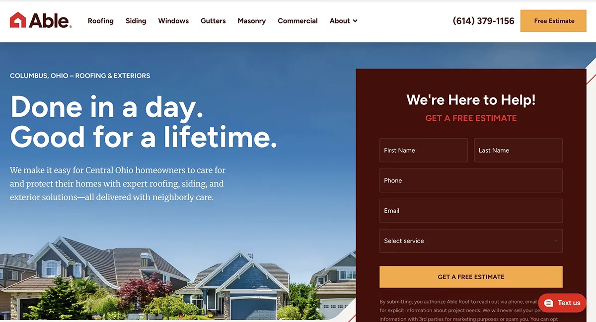
3. Able Roofing
Able Roofing’s website does an excellent job balancing service depth with simplicity.
The site clearly communicates multiple services without overwhelming the user. Experience and reputation are reinforced through messaging and trust signals, while CTAs make it easy to request a free estimate.
The layout keeps users focused and avoids unnecessary distractions.
Why this site converts:
- Clearly defined service categories
- Strong credibility indicators
- Simple, direct CTAs
- Straightforward UI that supports decision-making
- Follows best practices for wireframing, ensuring clear content hierarchy, intuitive user flow, and a layout designed to guide visitors toward conversion.
Key takeaway: Clarity paired with credibility builds homeowner confidence quickly.
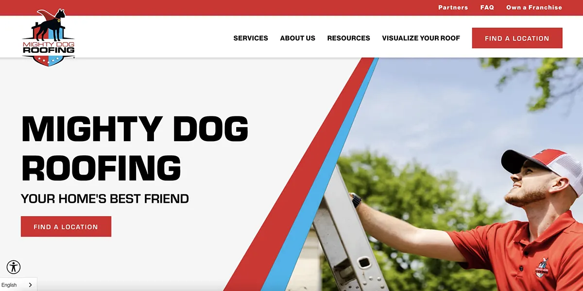
4. Mighty Dog Roofing
Mighty Dog Roofing stands out by combining strong branding with interactive tools that enhance engagement.
The branding is cohesive, memorable, and instantly recognizable. Beyond visuals, the site includes interactive elements that help educate users and guide them through the decision-making process.
These tools keep users engaged longer and increase confidence before they ever reach out.
Why this site converts:
- Strong, consistent branding across the site
- Interactive tools that increase engagement
- Clear service presentation
- CTAs placed alongside interactive elements
Key takeaway: Strong branding paired with interactivity keeps users engaged and moving toward action.
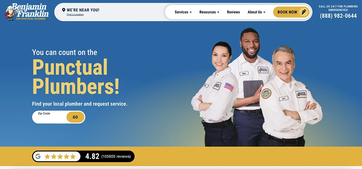
5. Benjamin Franklin Plumbing
Benjamin Franklin Plumbing is a great example of how structure, trust, and urgency drive conversions.
Plumbing services are often needed quickly, and the site reflects that urgency while remaining organized and reassuring.
Services are clearly broken down, availability is emphasized, and trust is reinforced through guarantees and reviews.
Why this site converts:
- Clear emphasis on reliability and availability
- Well-organized service breakdowns
- Prominent guarantees and trust messaging
- Strong review visibility
Key takeaway: When urgency is high, clarity and reassurance are essential for conversion.
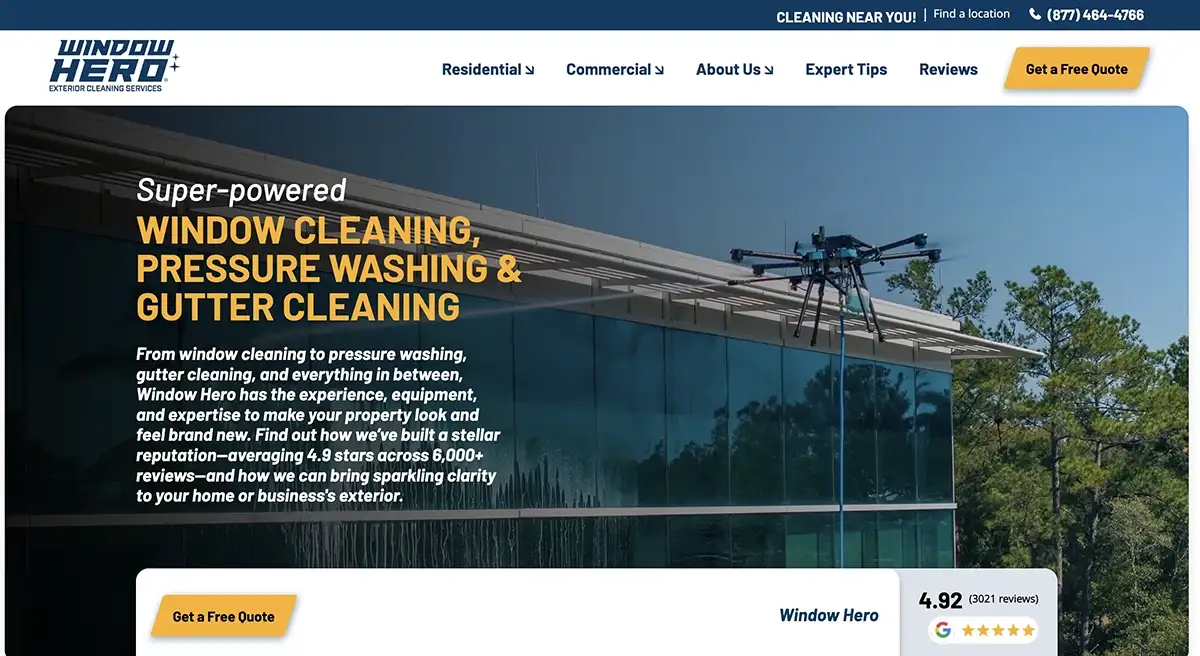
6. Window Hero
Window Hero excels at visual clarity and logical service grouping, which is especially effective for exterior and cleaning services.
The design is clean and modern, making it easy for visitors to understand what’s offered and how to move forward.
Reviews and CTAs are clearly integrated without overwhelming the experience.
Why this site converts:
- Clean, modern UI with strong visual hierarchy
- Logical grouping of services
- Visible CTAs and social proof
- Scalable layout across locations
Key takeaway: Clear visuals and simple service paths reduce friction and increase trust.
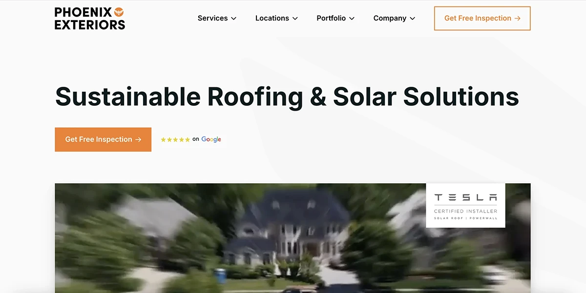
7. Phoenix Exteriors
Phoenix Exteriors is a strong example of how UI/UX design and color psychology influence conversions.
The overall experience feels premium and intentional. CTAs are placed in the right spots, and the use of color helps draw attention to key actions without overwhelming the page.
The visual hierarchy naturally guides users from content to conversion.
Why this site converts:
- Clean, intuitive UI/UX
- Strategic CTA placement
- Effective use of color psychology
- Strong visual flow and readability
Key takeaway: Thoughtful UI/UX and intentional color usage guide users toward action without friction.

What These High-Converting Websites Have in Common
Across all seven examples, clear patterns emerge:
- Easy-to-understand navigation
- Strong branding and trust signals
- CTAs placed where users expect them
- UI/UX designed around user behavior
- Websites treated as marketing assets, not templates
These sites don’t just look good, they’re intentionally built to convert traffic into qualified leads and jobs.
Final Thoughts
If your home services website looks decent but isn’t generating consistent calls or quote requests, the issue is rarely traffic alone.
More often, it’s web design, structure, messaging, and user experience.
The examples above show what’s possible when a website is built with clarity, trust, and conversion at its core.
In 2026, the most successful home service businesses will be the ones whose websites actively work to grow the business, not just represent it.
If you’re unsure whether your contractor website is helping or hurting your growth, a professional review can quickly uncover missed opportunities.
Need Help With Contractor Marketing?
We specialize in helping home service businesses upgrade their websites, SEO, and lead generation.